

When it comes to lead generation and conversion to sales, Calls to Action (CTAs) are a crucial part of any digital marketing campaign.
They’re not a new thing.
They’ve been used since the very first catalogue was posted through the first letterbox.
They’re the digital equivalent of what any good salesperson would call ‘asking for the sale’.
While it isn’t always an invitation to buy, a call to action is an invitation to take a specified action.
It could be to sign up,
To download,
To write a review…
Whatever you need your target to do.
So, when you’re putting pen to paper, here are 5 Ws to remember.
[bctt tweet=”If you don’t ask, you won’t get – the 5 W’s of writing great calls to action. #marketing” username=”feedalpha”]
1. Words!
Choose your words carefully.
Once you have carefully clarified what you are hoping to achieve, your call to action needs to be action-oriented… the clue is in the name.
A CTA needs to reinforce what came in the text leading up to it and the text leading up to it must do the heavy lifting for the CTA!
It must be short but pack an incredible punch to compel customers to click.
Use language that will elicit an emotional response,
build excitement…
and never underestimate the power of the exclamation mark!
Take Netflix for example. Just check out their homepage

Their language is superb. ‘Watch anywhere. Cancel at any time.
and then there is the red contrasting button ‘Watch Free for 30 Days’
No risk because you can cancel any time but you get unlimited films, TV programmes and more.
what is there not to like…
You may also find that adding a secondary CTA can work – people may not be ready to follow your main CTA but that doesn’t mean you have to lose them altogether.
Give them options: for instance,
if they don’t want to sign up and get the free download (primary CTA),
they may still be interested in finding out more about your company and offering (secondary CTA).

The secondary CTA example above could simply be a link to more blog posts in your copy.
You can also consider Social Media share buttons as a secondary CTA.
Remember you are trying to get visitors to take an action – give them options…
2. WIIFM?
Is that even a word?
OK, it’s an acronym and it stands for What’s In It For Me?
Give your prospect a reason to take action: your CTA must be benefit-oriented and create a sense of urgency.
What will they get out of this?
It could be a substantial saving, a freebie, an e-book, tools, premium services, improved health and well-being or peace of mind. instead of ‘Sign up to our newsletter’ put ‘Sign up for all the best juice recipes and tips on juicing’.

Brian Dean from Backlinko has an awesome CTA on his Blog page.
‘Sign up for Exclusive Traffic Tips’ – Who doesn’t want exclusive traffic tips to grow their business?
and then this line seals the deal – ‘The same tips I used to double my traffic in just two weeks!’
If it’s appropriate, using figures can also be a great hook as they make the value more tangible.
So do mention the price,
the discounts,
or anything that quantifies exactly what the advantage is for them.
Try to capitalise on two things when picking your words:
FOMO!
Fear of missing out on a limited time offer for a great bargain is sometimes all the incentive that’s needed.
The need for instant gratification
People want it all and they want it now, so look for ways to provide immediate value.
A powerful CTA will get them clicking without hesitation for an instant reward.
3. Where?
Wherever you decide to place your CTAs, whether it’s in an email, as a pop-up, or on your website or blog, make it easy to find on the page.
You want your prospect to hit that CTA just when they’re primed to click.
The purpose of your CTA should give you a clue as to where it needs to go.
For instance, those ‘call now for a quote’ type requests will probably be on pricing or products detail pages, but promotions and offers may be on your homepage, on a specific landing page for the promotion/offer.

The above example is an inline CTA for a Business website that links directly to MailChimp to collect those all-important email addresses.
This is on the Homepage but there are other versions dotted throughout the site.
Sign up CTAs are generally on the blog landing page and often the homepage too.
As for within a blog post, it is not recommended to put a CTA too near the beginning, because your reader may not be ready to jump away from the article.
In blogs, or even on web pages containing long-form content, you typically find the CTA at or near the end, so that the reader is 100% ready to click on that button as a result of reading the content.
CTA Placement
There is no hard and fast rule: just make sure that the CTA appears where it is most relevant for your reader, taking into consideration their goals and expectations.
4. Wow!
Your CTA must stand out on the page, so make it pop. So, how do you make it stand out?
Make sure the size is right: not so small that it will get lost on a page, but not so big that it stops making sense (some call it “banner blindness”).
Colours also need to jump out!
Go for colours that are basically opposite to your main colour scheme.
Brightness pays: red and orange apparently lead to high click volumes but bear in mind the colours you choose for your buttons and text should be legible and easy on the eye.
An image can be great too: strong visuals, such as a picture of your product or someone enjoying the product/service will speak volumes.
5. Watch!
Once you are happy that you have some great CTAs, don’t rest on your laurels.
Stay creative and try different things out…
and then monitor the clicks and responses.
There are some handy tools out there, such as:
- Scroll maps: they show you how far people scroll before clicking off. This enables you to figure out prime spots for your CTAs
- Heat maps: they are a very visual way to see how “hot” your CTA button is. Red means lots of clicks! Blue not so many…
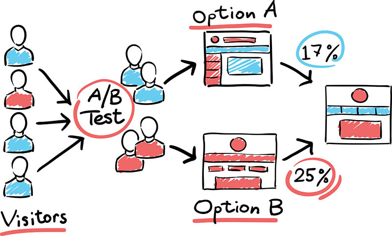
- A/B tests will let you run two versions of the same CTA simultaneously to see which is most effective – you can vary format, wording and/or location.
Testing makes perfect: use the tools at hand to work out what has maximum impact and conversion rates.
For something so small, a CTA can have a huge impact on your business!
Yet it is shocking how many of us completely forget to put them on the page.
Get into the habit of using the 5 Ws and clickable CTAs, will be guaranteed.